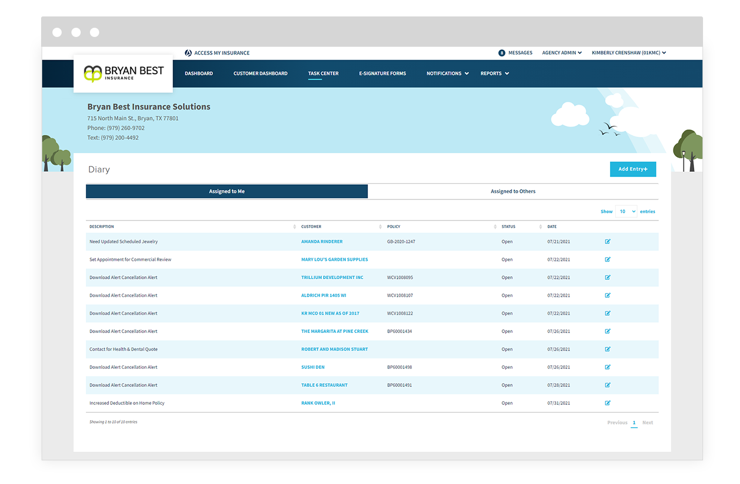
If you have signed into Access My Insurance (AMI) recently, you will have noticed quite a few new changes. But we haven’t just popped into a new suit, we’ve gotten down to business. You’ll see a lot of very obvious updates and improvements to AMI, but we also want to tell you about the not so obvious ones.
When you sign in to AMI you’ll be greeted with a whole new experience. You’ll notice all the visual updates instantly, but we also focused on how to make our product more intuitive. We’ve reorganized a few things, added some others, and allowed for a more customized and branded platform for you and your clients. We also took a look at the logic behind how things were set up to create a platform that is easy to navigate and use from day one. Here’s a list of the biggest updates released.
Branded Like a Boss
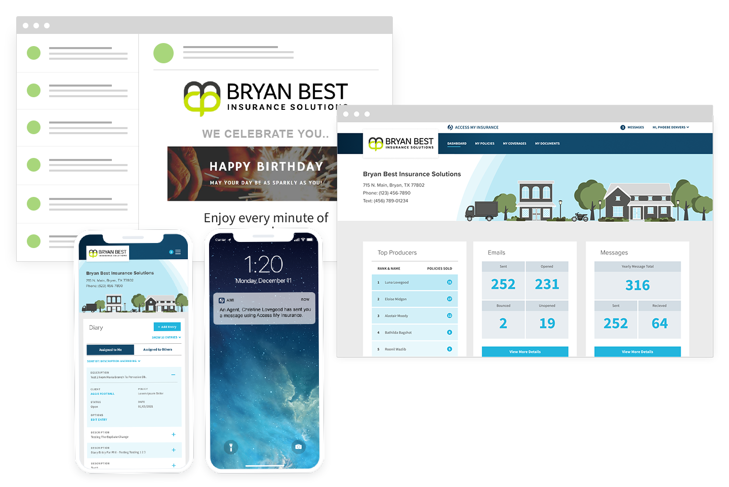
At every turn, we have created AMI to showcase and spotlight your agency’s brand. Once you sign in you’ll notice your logo front and center, as well as your agency information that may be useful to the user. To further personalize your AMI, you choose what color all the illustrations throughout the site will be. That means that your account will not look like any other. In addition to this, all of the updates also apply to the new customer mobile app. This builds brand recognition to your customers, and increases their trust in you as you build relationships with them.
We’ve already talked about how important your branding is in a previous post, which is why we haven’t stopped there. If you haven’t used AMI or are new to some of its features, you may not know about our automated marketing tools. For those who are unfamiliar, we have curated marketing content that is ready to work for you from day one. Just set it up and this becomes a no-touch tool that automatically sends emails to cross-sell current customers, remind and encourage policy renewals before they expire, recognize all holidays and special events, and much more.
Put Your Feet Up On The Dash
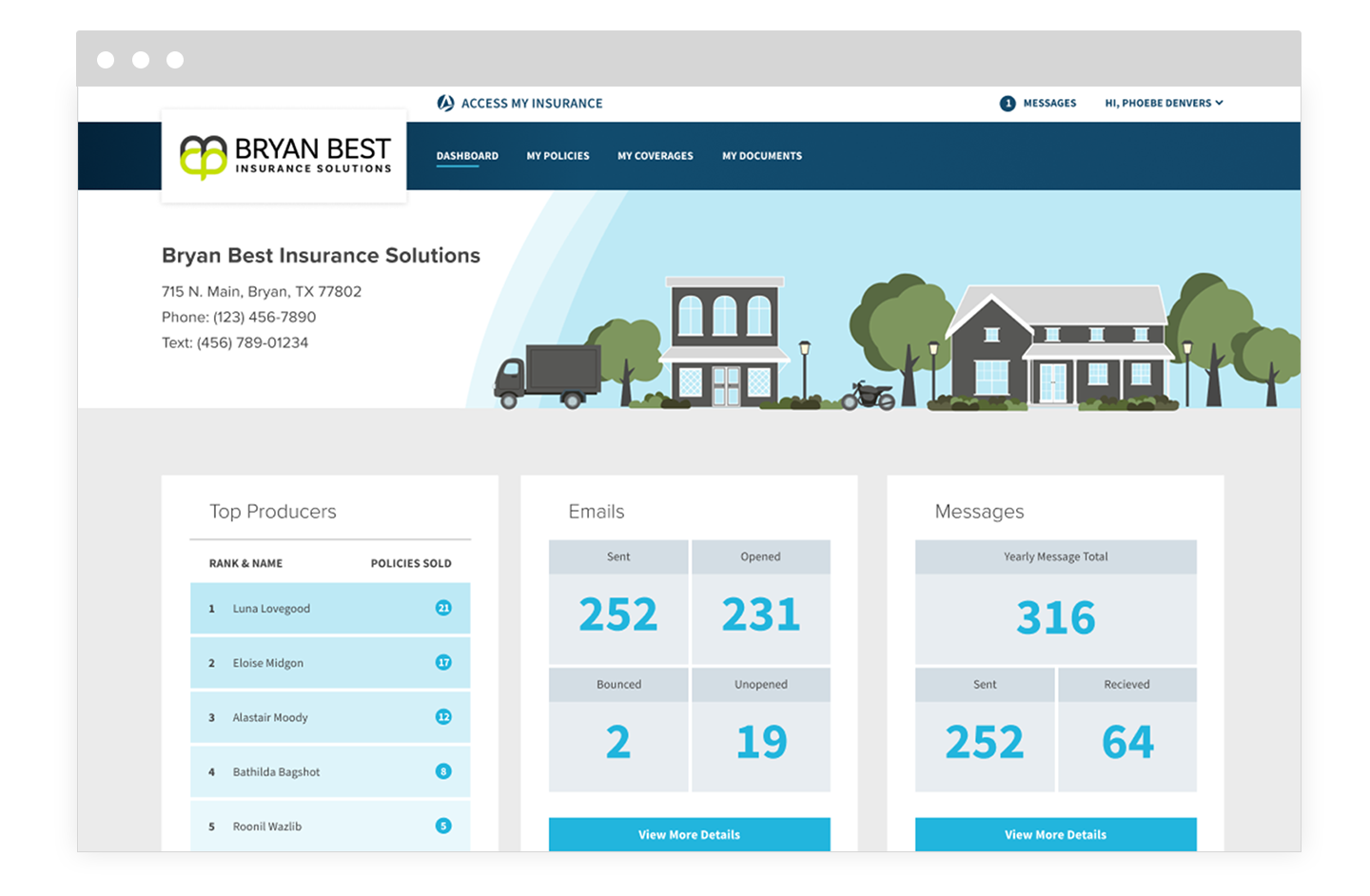
No longer take 4-5 clicks to get to the information you came for. With our new user dashboard, you will have a snapshot of your most pertinent information right when you sign in. This dashboard has custom data based on the type of user who has signed in. For example an admin would have more overarching information about the business as a whole then say a producer or a customer.
This view also gives you a high-level view of any priorities that need to be tended to right away. You’ll see things like unread messages, open tasks, bounced emails, unsigned documents, and so on. Just like in a car dashboard, all the important things are front and center. It would be ridiculous to hide the check engine light in the glovebox, right? Our user dashboard also keeps all the most important things right at your fingertips the minute you sign in.
Portals and Branding and Apps, Oh My!
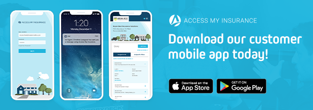
If you want to know why having a customer mobile app in this day in age is important, take a look at our previous article, “How Will Our New AMI Mobile App Help Your Agency?” Our new updates are all applied to our customer mobile app as well. Your branding stays front and center in the mobile app creating visual and brand consistency for your client.
Within the app, your users will have full access to the AMI portal and instant access to secure messaging. Built in notifications ensure an even quicker and more convenient line of communication between you and your client.
“You Get a Report, And You Get a Report!”
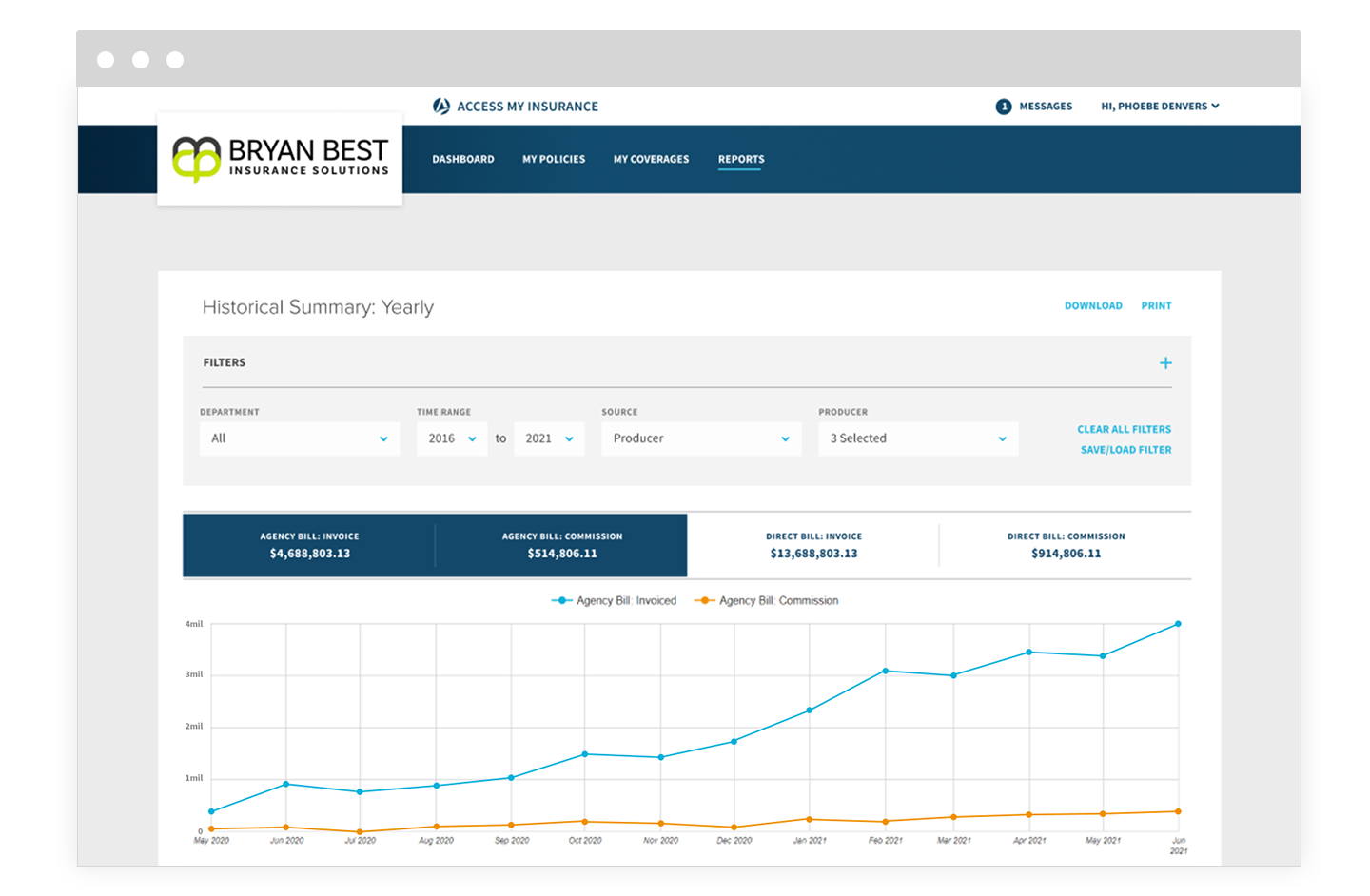
One of the biggest new features in our latest update is the extensive reports you’ll be able to run. Managers will now have a menu item labeled “Reports” that gives you access to all your most up-to-date data. You can go wild running any report you wish.
Within the navigation drop down we’ve separated out reports on your net-new business and your retention. Now you’ll be able to monitor and understand the health of your business with little effort on your part. Especially with the net-new business. Most products or software leave the calculations up to you, requiring you to catch all probable rewrites to get an accurate number. With AMI we take care of that calculation for you so you can compare numbers easily, no scratch paper required.
On Task Like, “1-2-3 Eyes On Me”
The new task center is what once was the producer dashboard. Previously only accessible by producers, now it is a place that all user types can access. This is a page that shows all diary entries (which function like to-do lists), submissions, and active/expiring/recently expired policies. It’s a way for each user to stay up to date and on task by looking at just one page.
Check It Out Today!
We are constantly improving to make sure you’re set up for success from day one. We have even more exciting updates coming in the near future that we are excited to share with you. Not only are we always growing and improving, but we will always be a secure and reliable platform your agency can depend on. Our goal is to make a product that is a no-brainer to help your business flourish. We are here for you every step of the way.
If you’re a Newton customer already, but don’t have AMI, what are you waiting for? Contact us today so we can tell you more about how AMI can help your agency run more efficiently, effortlessly help with your marketing, and increase your bottom line with little to no work on your part.


